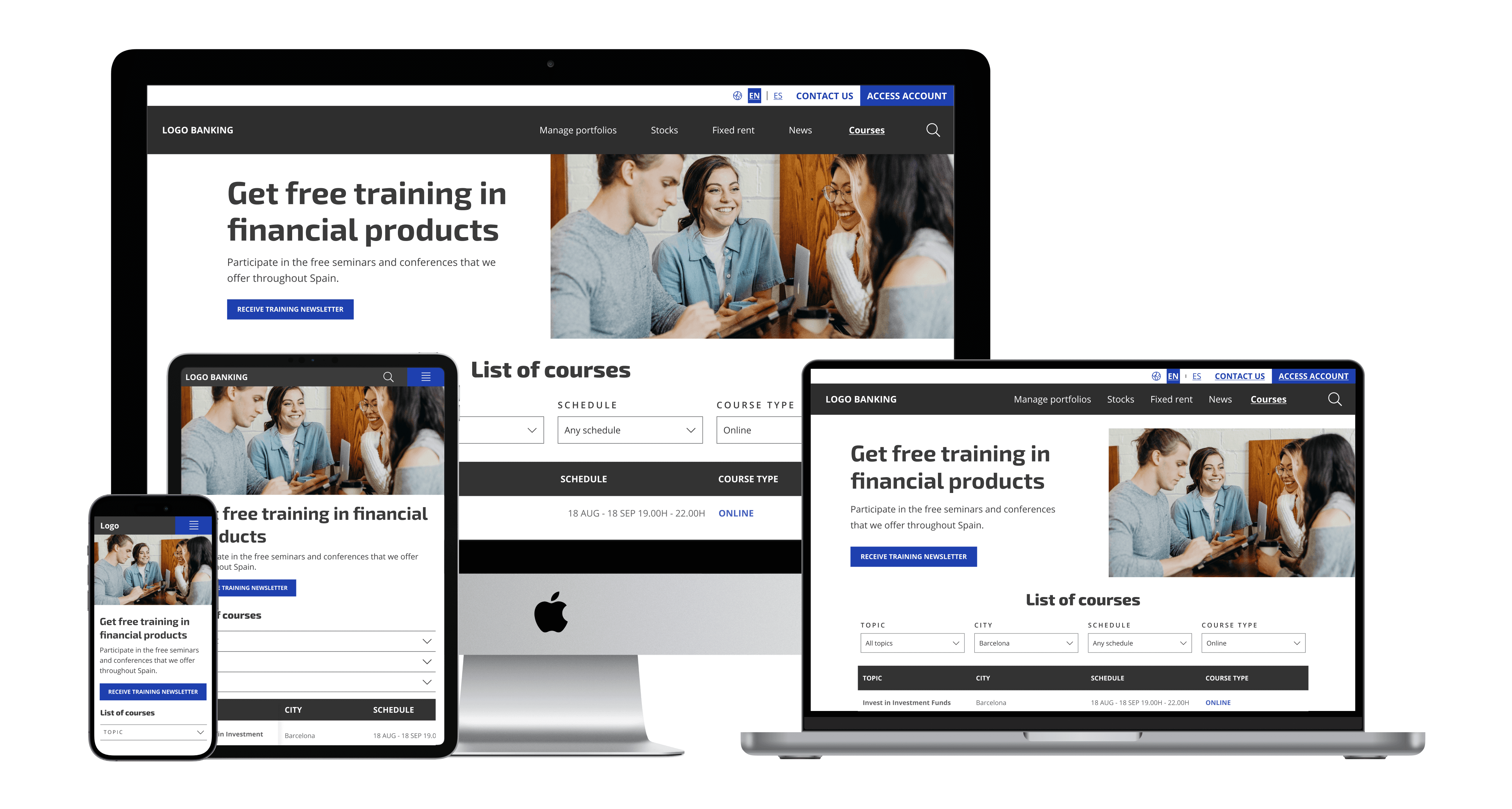
UI Kit for a Spanish Bank
This UI kit helped maintain the bank's brand and design consistency, enhance user experience, and simplify development processes.
Due to the confidentiality agreement, not all documents can be shared.
🗓️ Completion Date
August 2023
👩🏼💻 Role
UI Designer
🧑🏽🤝🧑🏻 Team
Project manager, Designer Lead, 1 UI Designer and 2 Developers.
📂 Deliveries
Style guide and components library
01 — THE CONTEXT
Who is our client?
It is a Spanish banking group that specializes in investment services such as asset management, brokerage, and corporate advisory. It has a strong presence in Spain and Luxembourg.
Their website serves not only as a portal for accessing the client's account but also as a source of information and education on investing and financial management.
02 — THE PROBLEM
The website's bounce rate was extremely high.
Using heat maps, we found that users did not engage enough with the content to explore additional information, scroll to the bottom of the website, subscribe to their newsletter, or interact with the UI elements.
03 — THE SOLUTION
We created a solid and consistent UI Library.
Most of the problems encountered in the research phase were caused by poor and inconsistent design. The goal was to fix these problems by improving their information architecture and UI Kit library.
The research team improved the information architecture. I was responsible for enhancing the style guide and components.
04 — THE PROCESS
04.1 — 💛 DEFINE PROJECT AND SCOPE
Kick off meeting with the Spanish Bank.
The project managers organized a meeting with the banking client to define the project's goal and business requirements and discuss the bank's challenges.
I attended as a listener to obtain first-hand information. After the kickoff meeting, our team gathered to share insights and first impressions and organize tasks.
04.2 — 🤔 RESEARCH, EXPERT REVIEWS
Enhancing product usability and user experience through expert evaluation.
I conducted a user-expert review of the current website and UI kit to identify inconsistencies and assess their effectiveness.
04.2.1 — EXPERT REVIEW, PROCESS
The steps followed to undergo the expert user review were:
I outlined the project's scope to review design elements like navigation, forms, buttons, style guides, etc. The goals areto identify usability issues using Nielsen's 10 usability heuristics and provide improvement recommendations.
I shared the insights in a document, organizing the findings from critical to minor, making recommendations on how to fix them, and noting their strengths.
I presented the document to our team, and then we had a meeting with our client to share the findings.
04.2.2 — EXPERT REVIEW, FINDINGS
Design inconsistencies and chaotic UI Library.
The call to action lacked consistency, using varying colors, labels, and shapes, which made it challenging to recognize and comprehend the primary action.
There were no specific UI elements or techniques to guide users through the page to discover more content and information.
The UI components in the UI library were not organized. The main components had many slight variations. The style guide was complex, with many similar fonts and colors.
04.3 — 🎨 DESIGN UI KIT AND ITERATE
What are the benefits of having a UI Library?
Speed up the design process and maintain overall consistency:
Spend less time creating components from the beginning and concentrate on devising improved solutions.
Reusable components and styles are ready to use, promoting consistency and saving time.
Make changes quickly. Edit the designs swiftly by modifying master components and styles.
Build responsive design websites and mobile apps. It can be applied to a wide range of design projects, from simple websites to complex prototypes for Android and iOS mobile apps.
04.3.1 — STARTING WITH THE STYLE-GUIDE
I revised and improved the following:
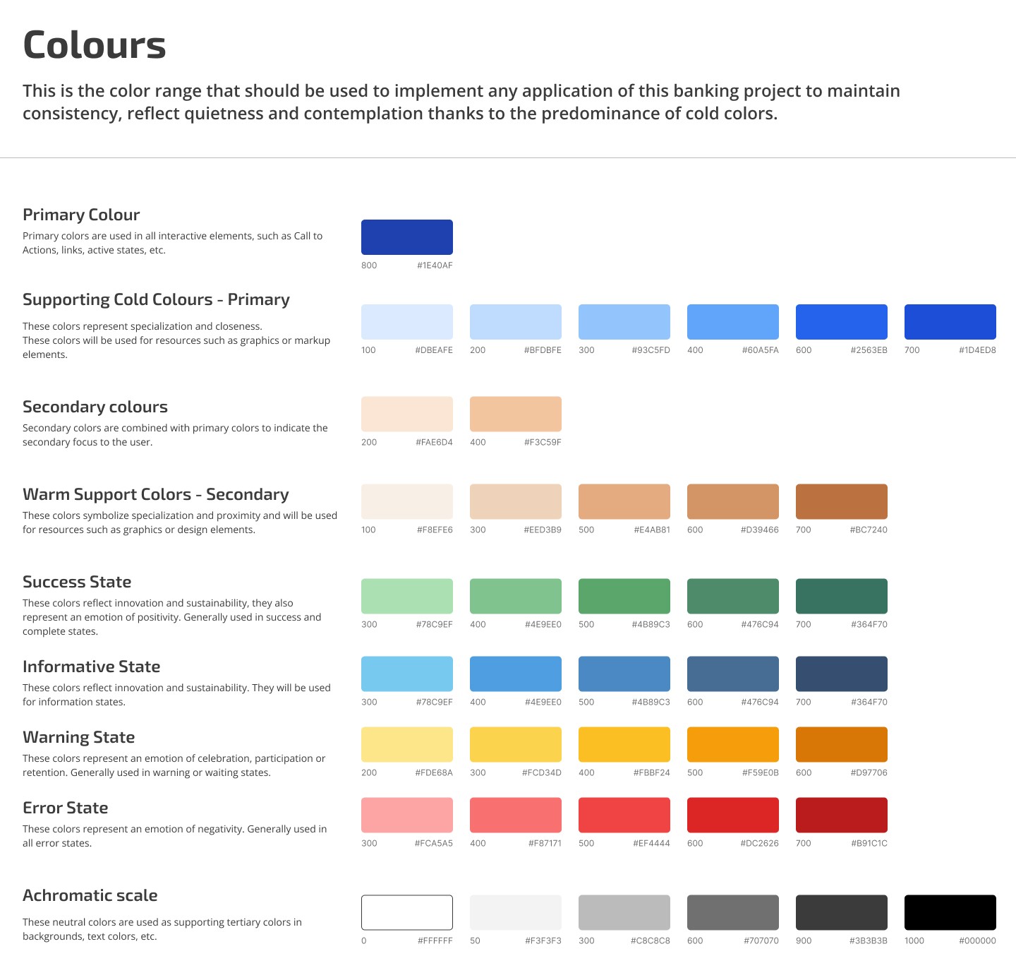
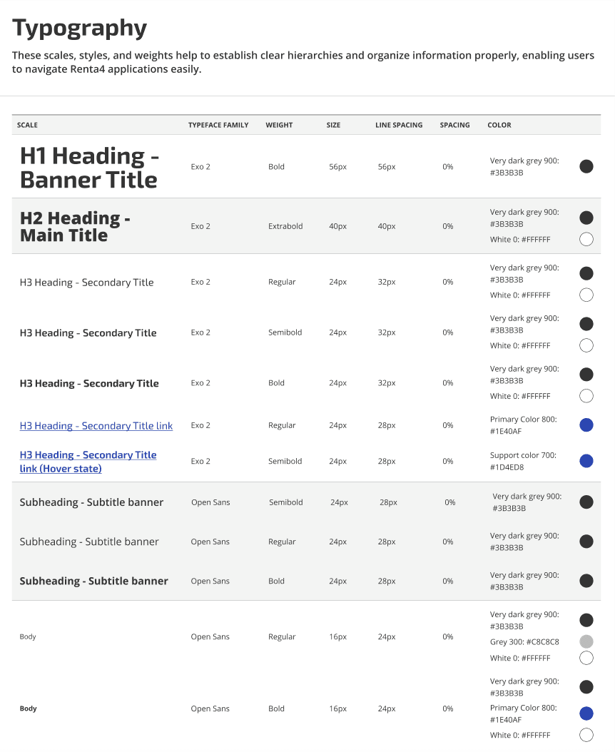
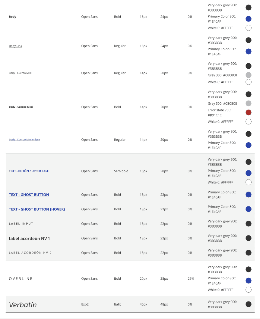
Branding (colors, typography, and logos).
Layouts grid.
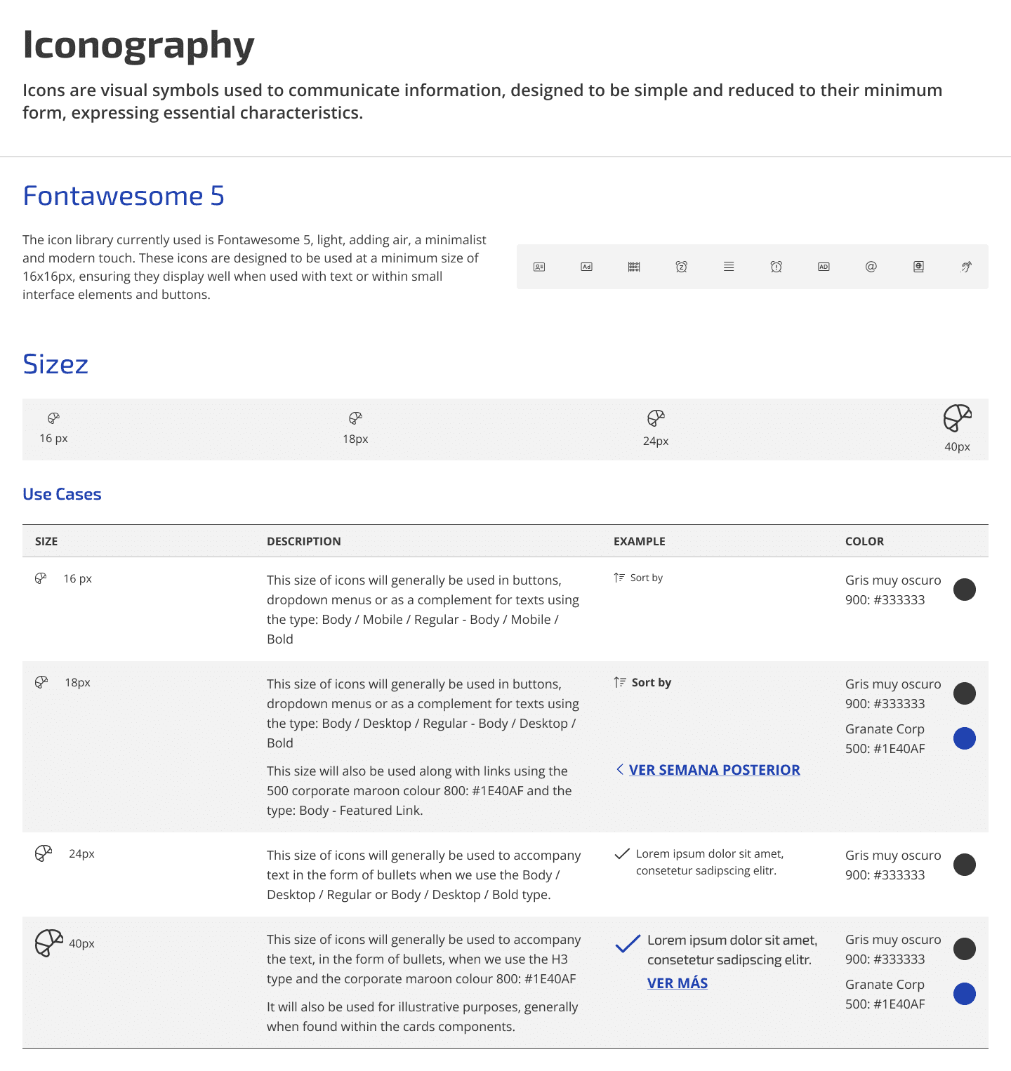
Icon packs.
Image style, graphics, and graphs.
04.3.2 — COMPONENT LIBRARY
Atomic Design methodology.
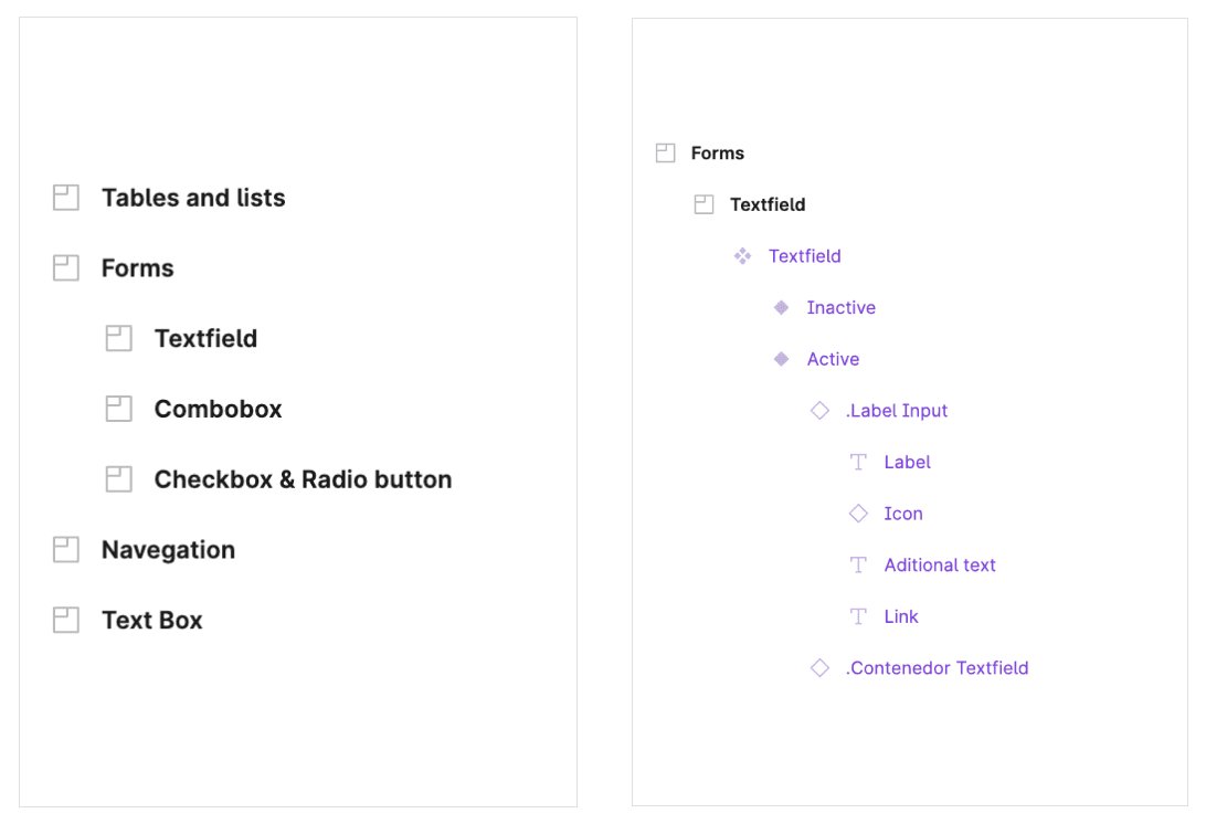
I broke the old interface down into fundamental building blocks and worked up from there, following the atomic design methodology.
Proper component naming.
Good naming is essential for a transparent organization. It enhances collaboration and facilitates the management and scalability of the UI Kit. It conveys the purpose, function, and hierarchy of the UI elements, and good naming can help avoid confusion and errors.
04.3.2 — COMPONENT LIBRARY
Well-Defined states.
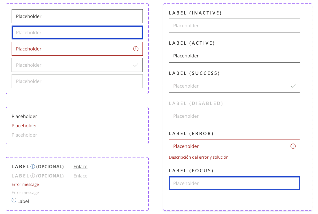
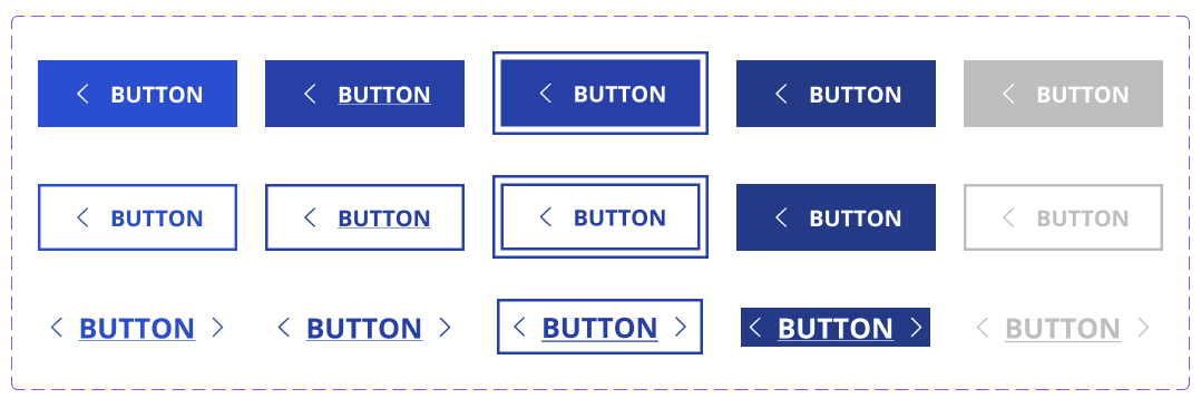
UI components should have well-defined states like default, hover, active, focused, and disabled to ensure discoverability, feedback, consistency, accessibility, and clear communication of interaction modes, leading to intuitive and user-friendly interfaces.
Responsive Design Components.
Components must adapt layout, size, and appearance across devices and screen sizes, ensuring consistent user experience and promoting efficient development and performance optimization.
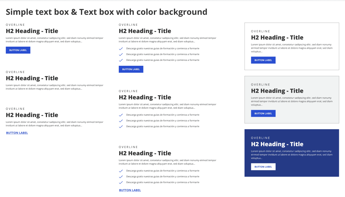
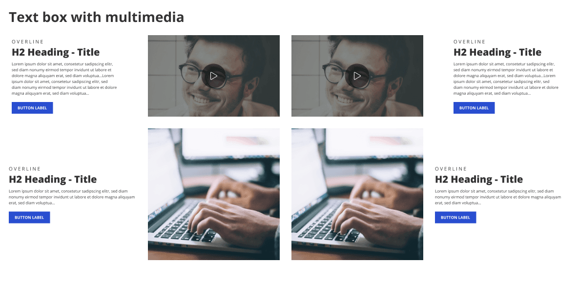
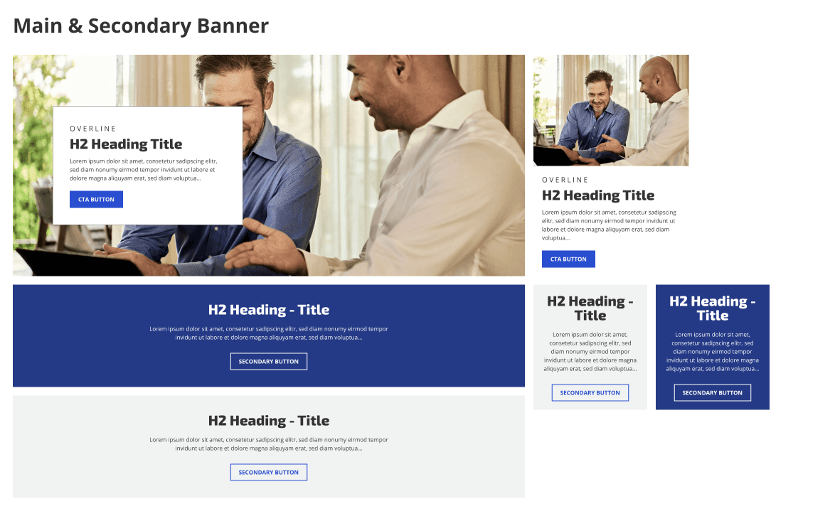
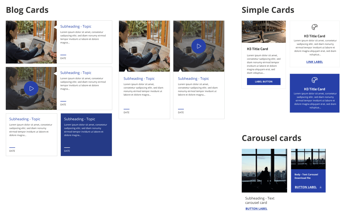
04.3.3. — EXAMPLES OF THE LIBRARY
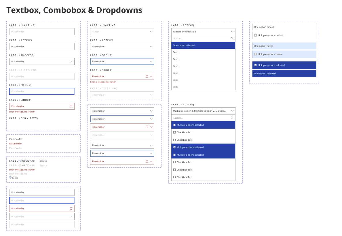
Some examples of the components I was working on.
The components are arranged here for showcasing. Each element in the UI Kit Library has its frame, state, and various variants to show how each component adapts to each device.
04.3.4 — DOCUMENTATION
Included in the same Figma File.
For this project, I have included the documentation on the same page as the component in Figma. We created a column next to each frame with information about component use cases, goals, etc.
Primary goal. Why have we created this component, and what needs to be solved?
Specific functionality. Is there a particular way that the component needs to behave depending on the platform used?
Use case. When should we use and not use this component, and why?
04.4 — 🎨 LEARNINGS
A UI Kit Library should be a living file.
Over time, the product or service will continue to evolve, so for the UI Kit to be the source of truth of design standards to help design at scale, it also needs to grow.
We can not have all the components in the first trial.
It's okay if we can't create all the components we need for our projects right away. We can start with the most common components and gradually add new ones based on our needs.
Developers and designers should work hand in hand.
Communicating more helps us understand each other's working styles and potential problems, leading to a more understanding and efficient collaboration.
